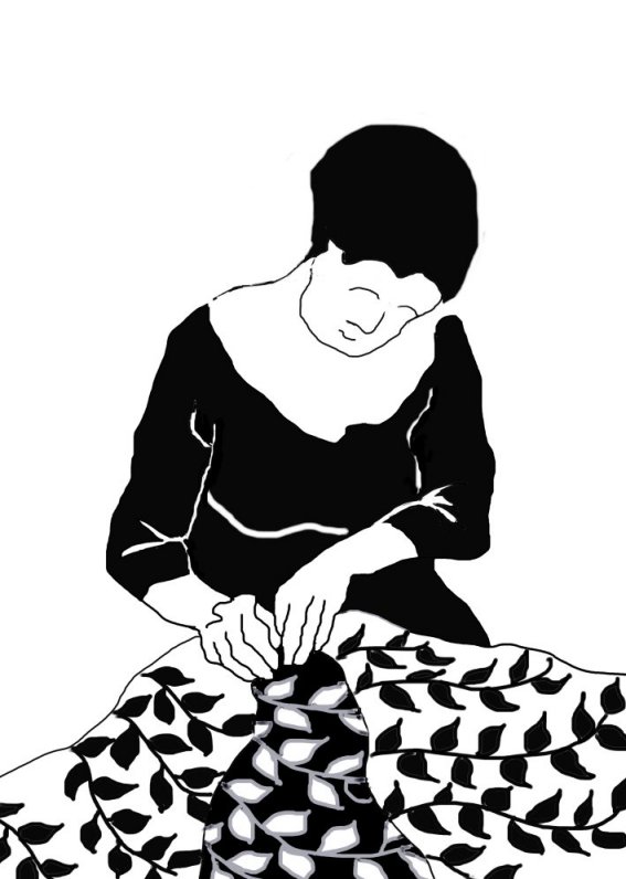
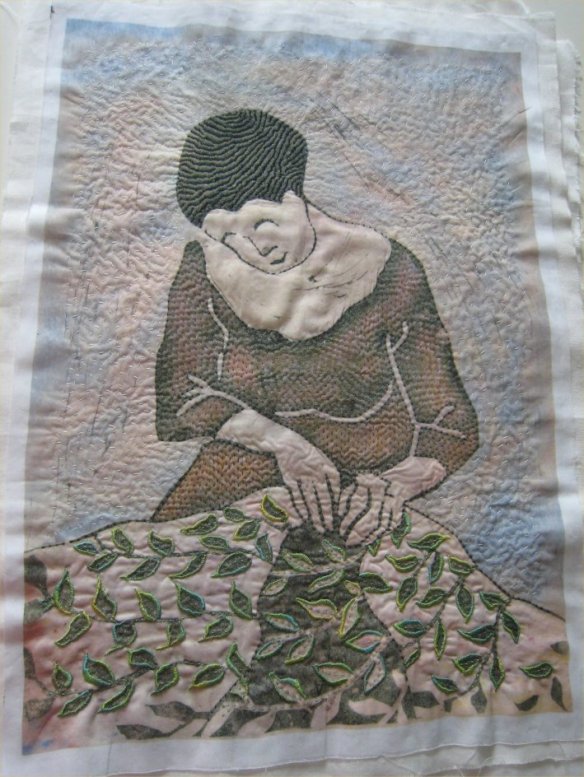
As with most pieces, Quiet work started as a doodle destined for lino cutting. She was printed while I was experimenting with the use of handmade papers prepared for inkjet printing. As she has such a large empty background – necessarily so – I used a photograph with faint texture and pale colour. (A close-up snap of the Serpentine pavilion which is now at Hauser and Wirth Somerset.)

The print came out well, and after I had scanned it I put it up in my print kitchen. But in order to stitch the piece I thought that more colour was needed, so I played around for a bit before printing the image onto cotton.
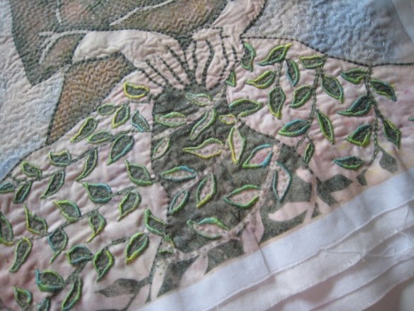
The balance of visual weight had to be at the base of the image, so I decided to use a different stitch with the leaves to try to achieve that. Also important is her hair, so more pattern detail was stitched into that. The background, however had to be kept separate and airy, so I used a seed stitch – and I’m still not completely happy with that. But it’s done now, and overall I’m pleased.

I like this…much needed and peaceful!
LikeLiked by 1 person
Hello Deirdre, and thank you for your comment.
LikeLike
As always so interesting to look behind the curtain & see the steps, follow the thought processes in the development of an idea. Am curios how the color suddenly showed up in the dress.
LikeLike
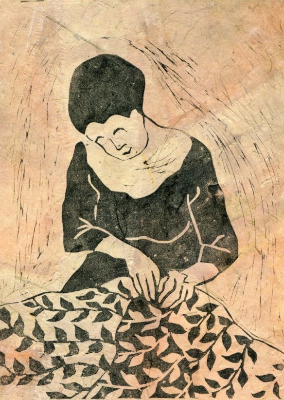
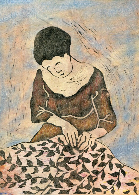
Sheila – it is interesting that you describe the addition of colour as suddenly showing up, because I still think of the process as magical in a way. I use a program called Painter for my digital drawing and colouring, and for a wide range of tweaks. In this case for all the addition of colour there is a facility which is like using a paint brush which is not loaded with paint, but with the contents of a file/picture. The blue around the figure came from a scan of soft pastels. The scant colouring behind the cloth with leaves came from a different scan of pastels.
The colour in the dress came from a photograph of red stems. I wanted sporadic but definite colour which was not distinguishable as anything in particular – in any case the stitching breaks it up further. But I do like the random appearance of the bits of colour.
The ‘paint brush’ function only transfers/deposits elements from the other file where wanted, and can do so straight, soft, in a spray, … and so on. It is indeed rather magical and I use it a lot. It is a wondrous way of using photos which have been taken for colour rather than for any compositional merit.
LikeLike
Thanks for that information. I think may have a similar function in my photo manipulation program. I know it can do amazing things if I only took more time to explore some of the less obvious functions. I will have to take a closer look at some of those that on the surface I don’t know exactly know what they mean. You have used this so effectively here.
LikeLike
Sheila, like the range of paint brushes themselves these programs have enormous potential if only we experiment – or are shown how to use them. I agree with you that the language used by the IT designers is often a barrier to exploration. I only use a tiny fraction of my Painter program’s capabilities, but I am content with what I do use – for the time being at least. Maybe if I did not stitch in such a slow way I might be curious to explore further – yet on the other hand I tend to start with the idea, or the visual idea and then find a solution as to how to present it rather than starting with the technique.
It is good to know, however, that there is still so much out there, even in one’s own little sphere, that can be explored and used … sometime.
LikeLike